3
Análises Exploratórias
Analises
Retornando ao conjunto de dados de diamantes:
library(ggplot2)
ggplot(data = diamonds) +
geom_bar(mapping = aes(x = cut))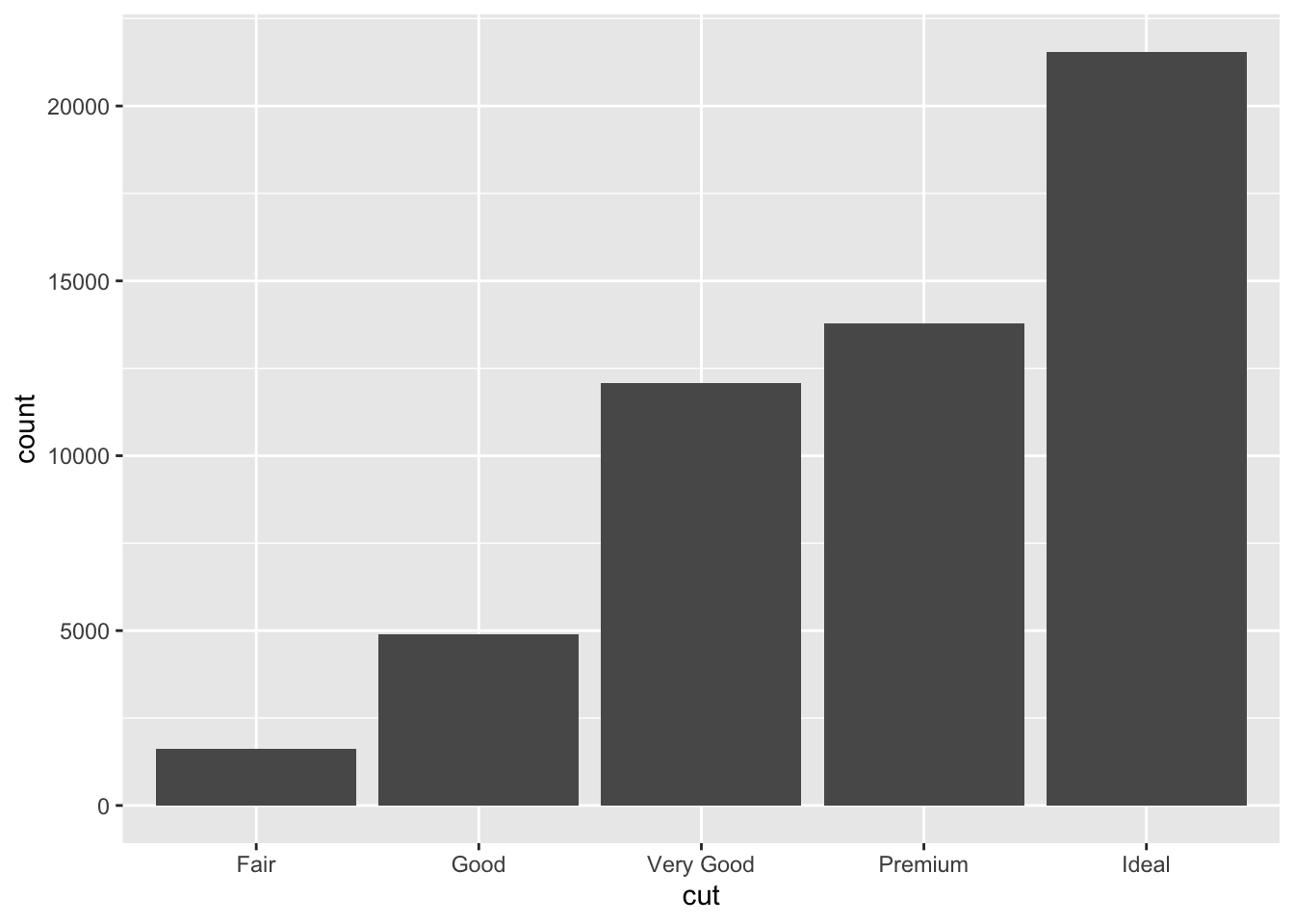 ## Contando os tipos
library(dplyr)##
## Attaching package: 'dplyr'## The following objects are masked from 'package:stats':
##
## filter, lag## The following objects are masked from 'package:base':
##
## intersect, setdiff, setequal, uniondiamonds %>%
count(cut)## # A tibble: 5 x 2
## cut n
## <ord> <int>
## 1 Fair 1610
## 2 Good 4906
## 3 Very Good 12082
## 4 Premium 13791
## 5 Ideal 21551Ajustando
ggplot(data = diamonds) +
 geom_histogram(mapping = aes(x = carat), binwidth = 0.5)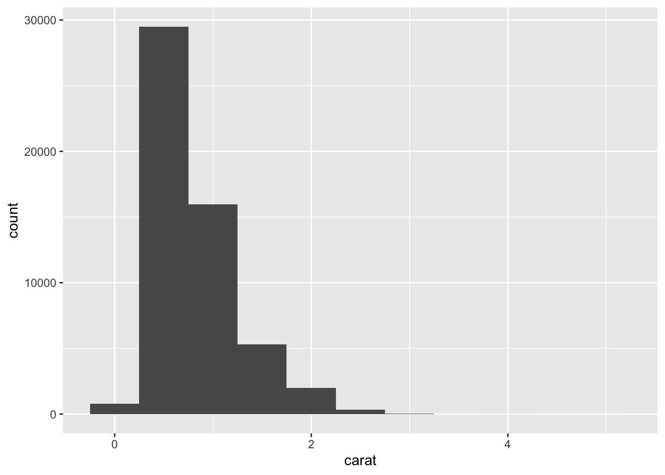
diamonds %>%
 count(cut_width(carat, 0.5))
## # A tibble: 11 x 2
## `cut_width(carat, 0.5)` n
## <fct> <int>
## 1 [-0.25,0.25] 785
## 2 (0.25,0.75] 29498
## 3 (0.75,1.25] 15977
## 4 (1.25,1.75] 5313
## 5 (1.75,2.25] 2002
## 6 (2.25,2.75] 322
## 7 (2.75,3.25] 32
## 8 (3.25,3.75] 5
## 9 (3.75,4.25] 4
## 10 (4.25,4.75] 1
## 11 (4.75,5.25] 1smaller <- diamonds %>%
filter(carat < 3)
ggplot(data = smaller, mapping = aes(x = carat)) +
geom_histogram(binwidth = 0.1)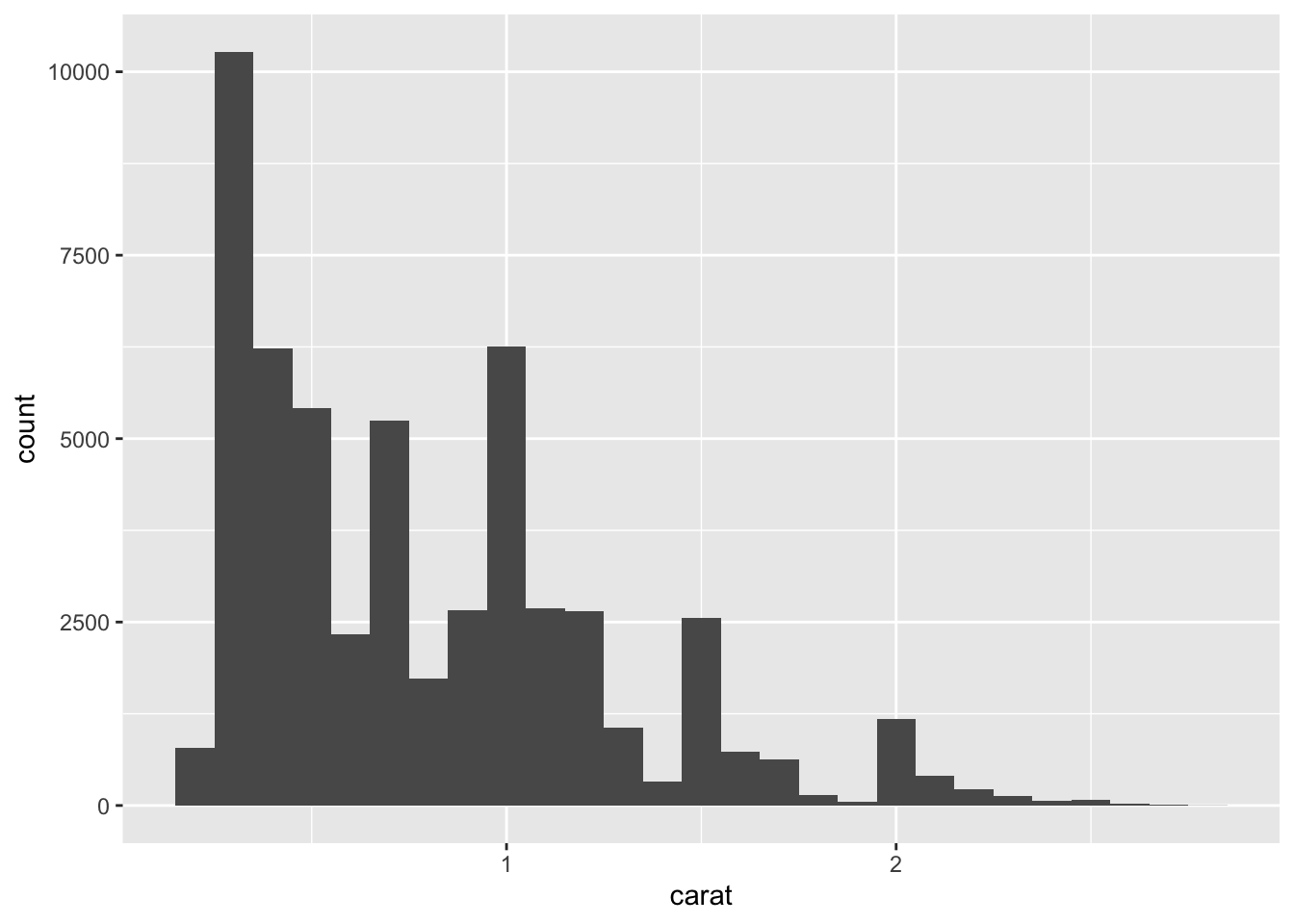
ggplot(data = smaller, mapping = aes(x = carat, color = cut)) +
 geom_freqpoly(binwidth = 0.1)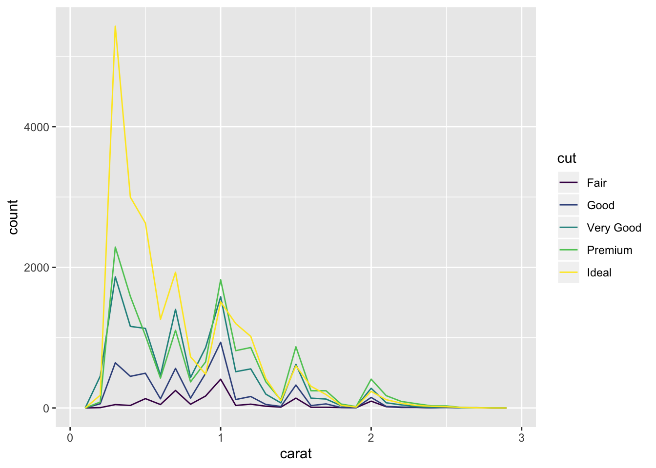
Valores tipicos
ggplot(data = smaller, mapping = aes(x = carat)) +
 geom_histogram(binwidth = 0.01)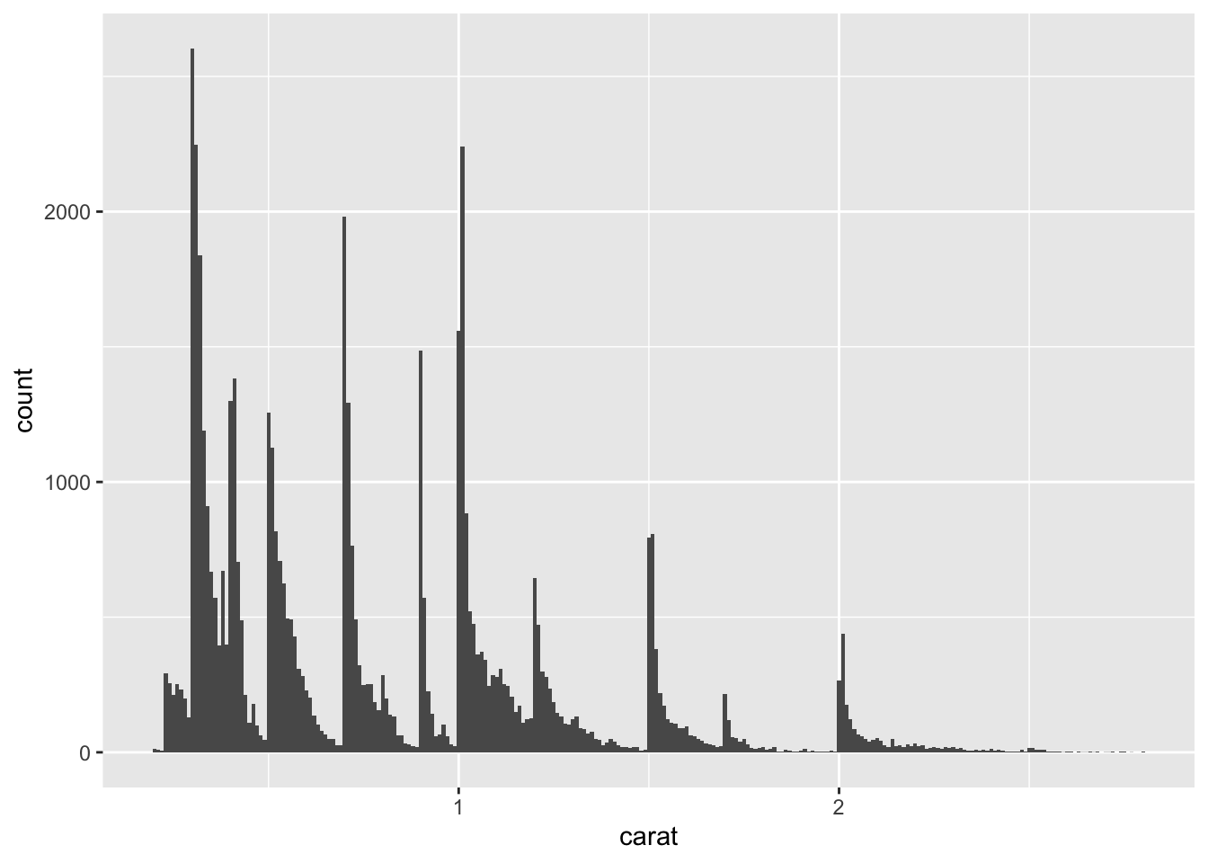
Valores sobrepostos:
ggplot(mpg, aes(displ, fill = drv)) +
geom_histogram(binwidth = 0.5) 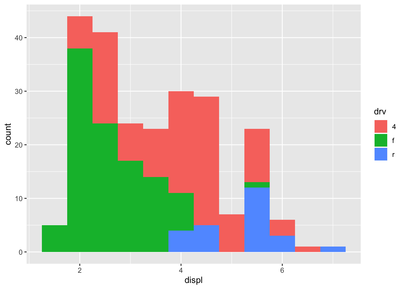
Facets:
ggplot(mpg, aes(displ, fill = drv)) +
geom_histogram(binwidth = 0.5) +
facet_wrap(~drv, ncol = 1)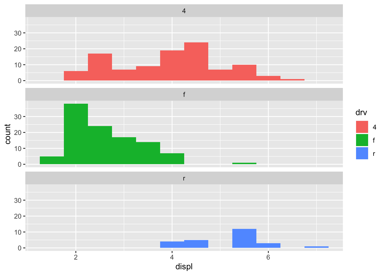
Variáveis categóricas x Contínuas
ggplot(data = diamonds, mapping = aes(x = price)) +
 geom_freqpoly(mapping = aes(color = cut), binwidth = 500)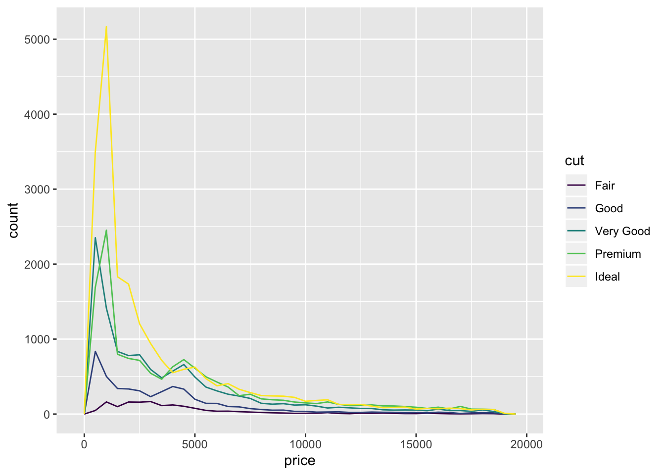
Bar plot
ggplot(diamonds) +
 geom_bar(mapping = aes(x = cut))
ggplot(
 data = diamonds,
 mapping = aes(x = price, y = ..density..)
 ) +
 geom_freqpoly(mapping = aes(color = cut), binwidth = 500)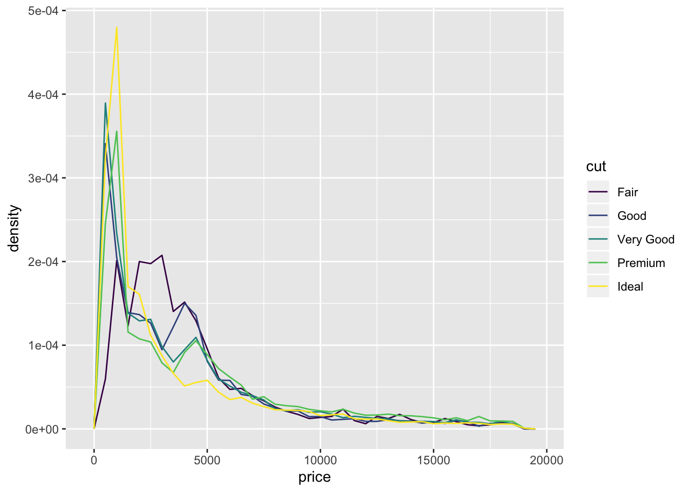
Localizando a média e amplitudes
ggplot(data = diamonds, mapping = aes(x = cut, y = price)) +
 geom_boxplot()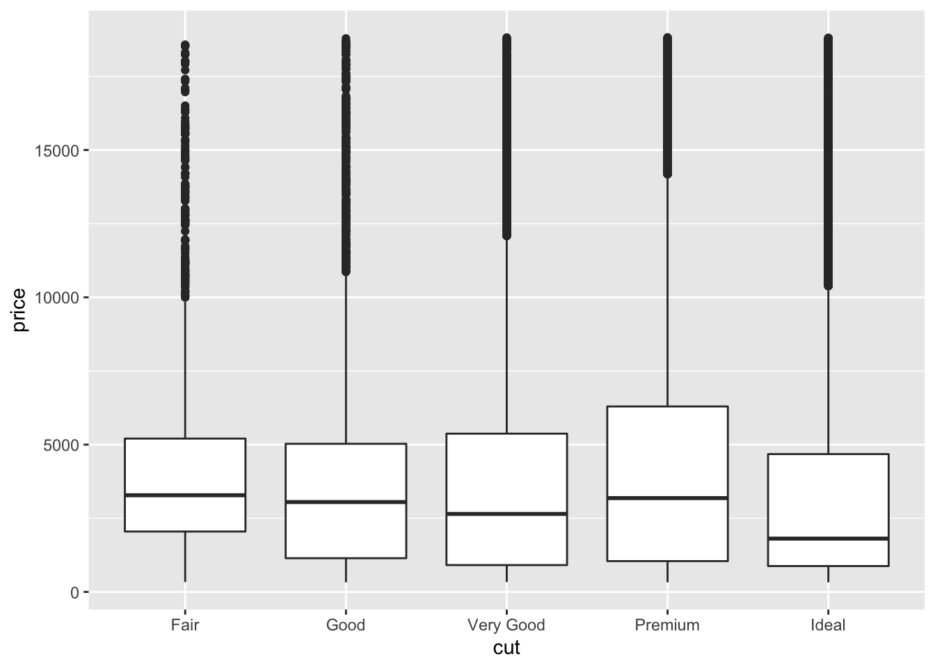
ggplot(data = mpg, mapping = aes(x = class, y = hwy)) +
 geom_boxplot()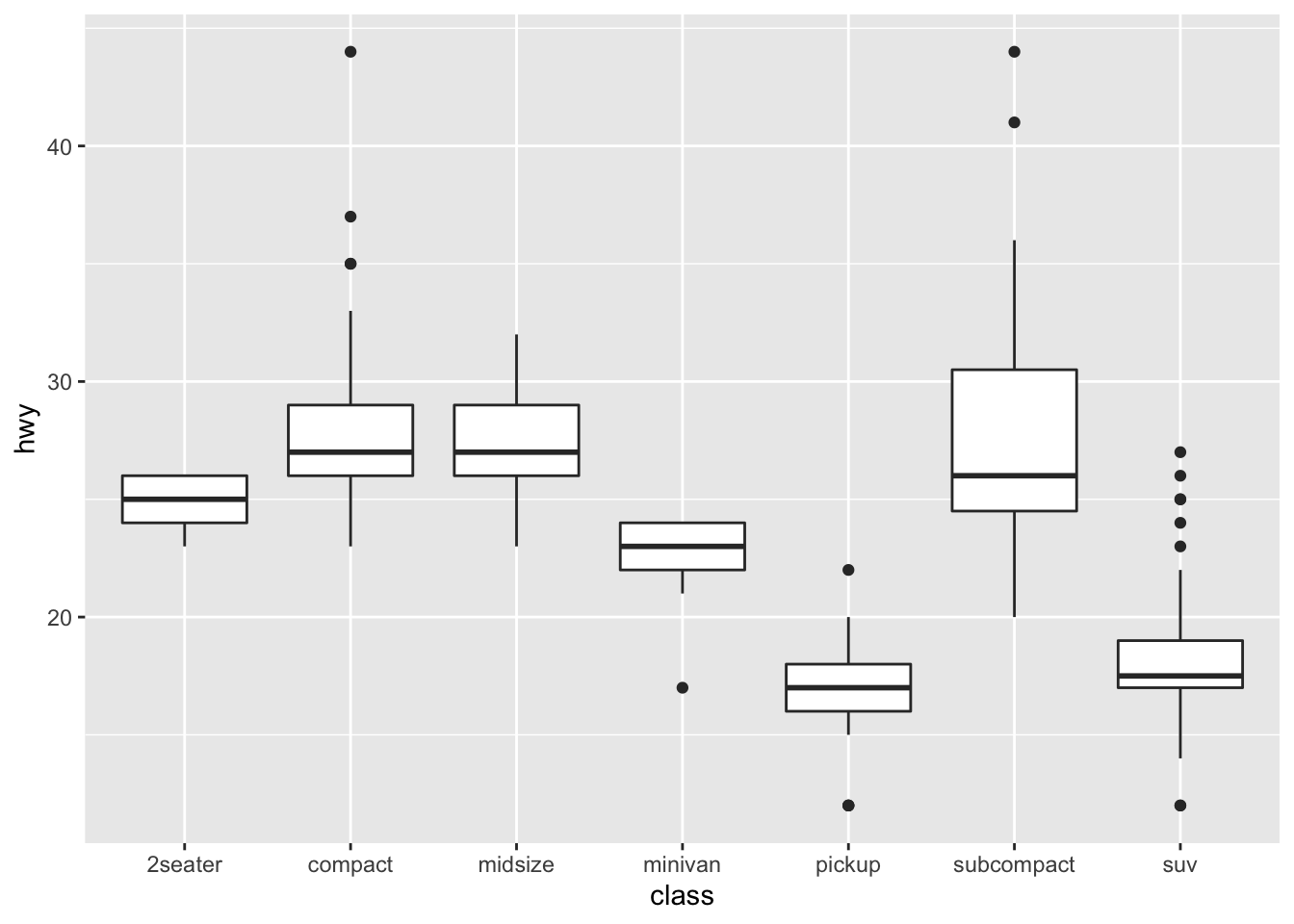
ggplot(data = mpg, mapping = aes(x = class, y = hwy)) +
 geom_boxplot() +
geom_point() 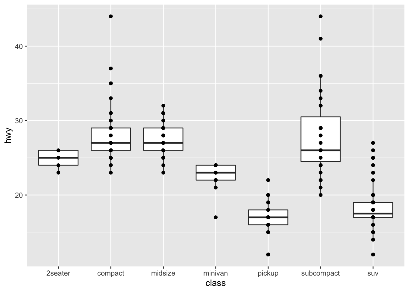
ggplot(data = mpg, mapping = aes(x = class, y = hwy)) +
 geom_boxplot() +
 geom_point() +
geom_jitter() 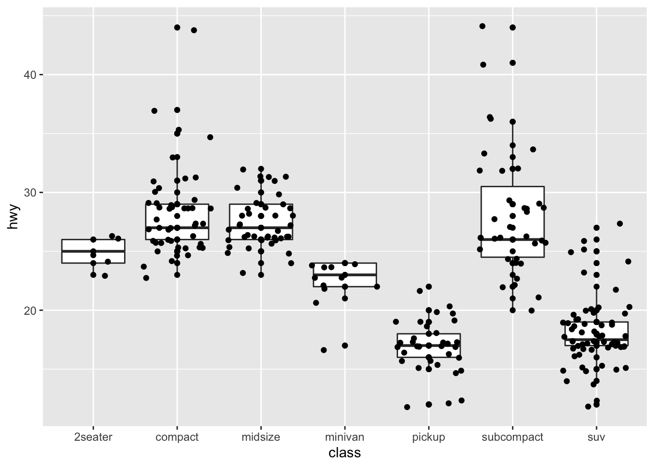
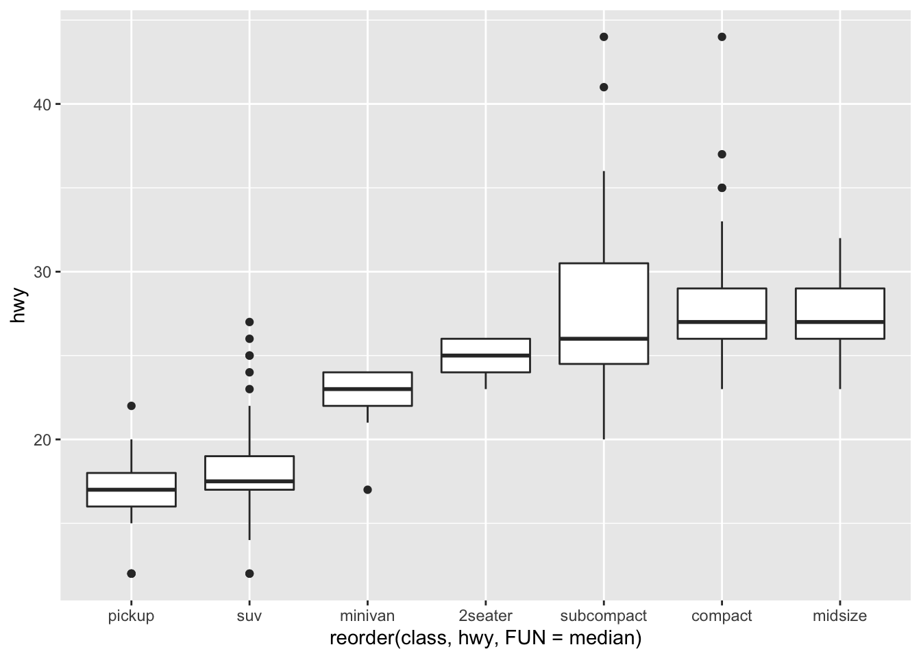
Mediana
ggplot(data = mpg) +
 geom_boxplot(
 mapping = aes(
 x = reorder(class, hwy, FUN = median),
 y = hwy
 )
 )
Rotacionando
ggplot(data = mpg) +
 geom_boxplot(
 mapping = aes(
 x = reorder(class, hwy, FUN = median),
 y = hwy
 )
 ) +
 coord_flip()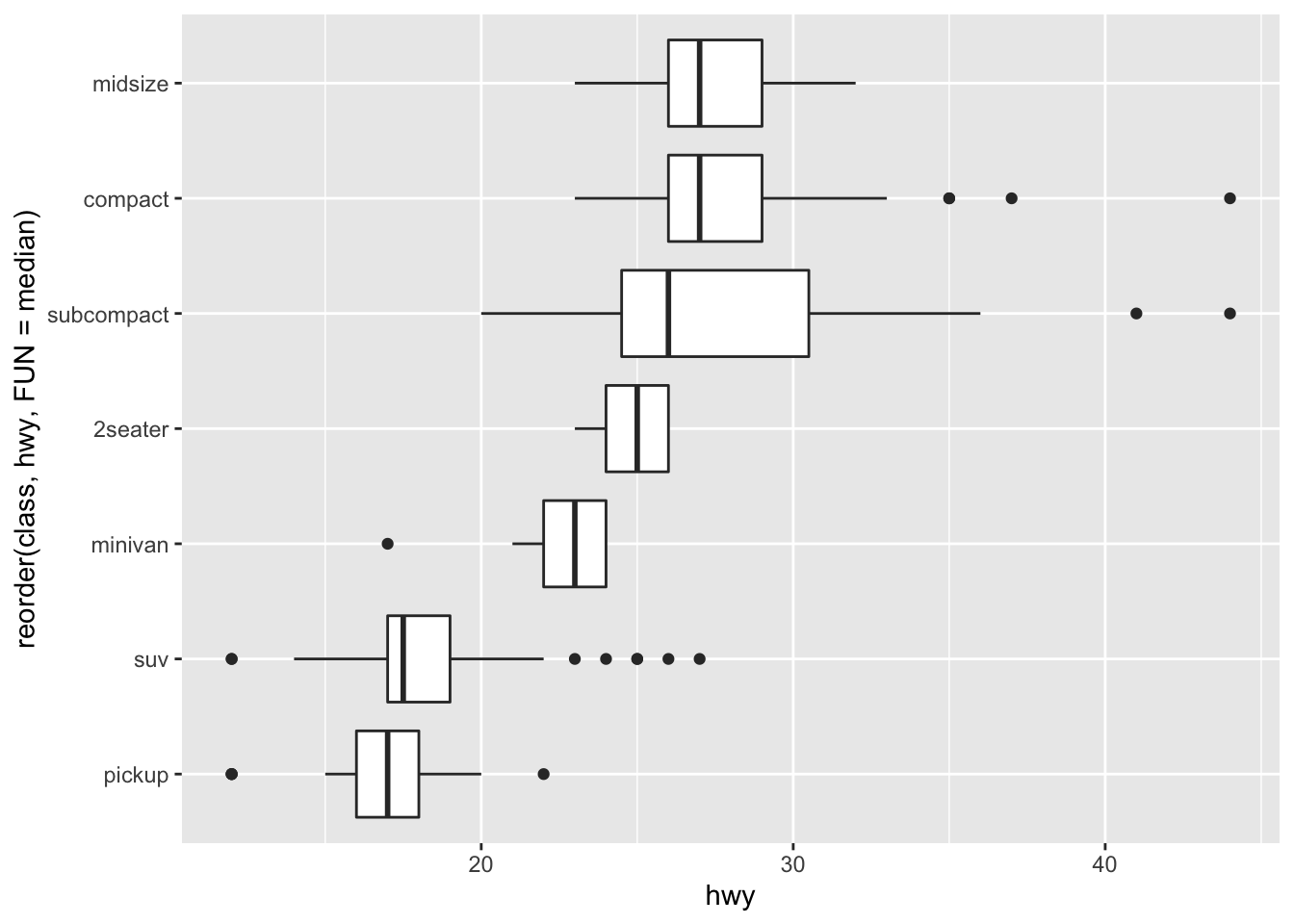
Trabalhando com duas variáveis categóricas
ggplot(data = diamonds) +
 geom_count(mapping = aes(x = cut, y = color, color = ..n.. ))+
 guides(color = 'legend')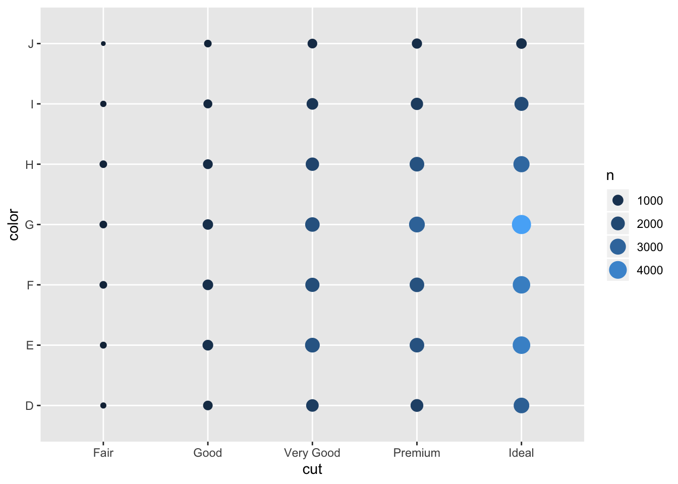
diamonds %>%
 count(color, cut) %>%
 ggplot(mapping = aes(x = color, y = cut)) +
 geom_tile(mapping = aes(fill = n))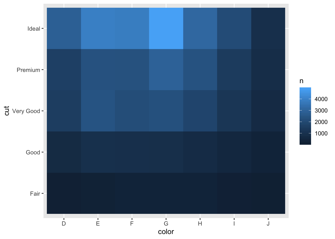
Criando intervalos regulares
ggplot(data = smaller, mapping = aes(x = carat, y = price)) +
 geom_boxplot(mapping = aes(group = cut_width(carat, 0.1)))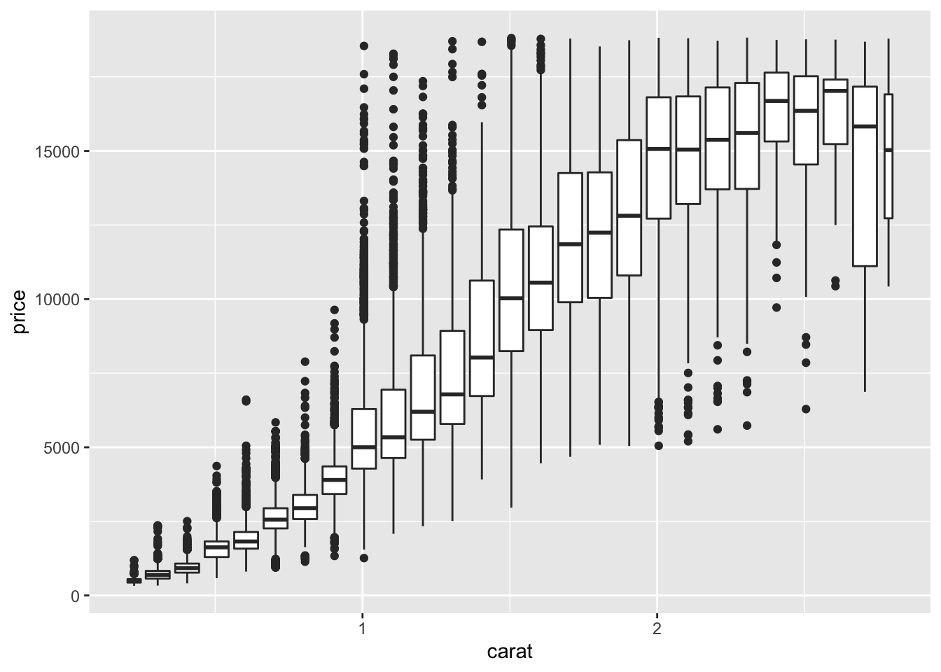
Criando intervalos com o mesmo numero de ocorrências
ggplot(data = smaller, mapping = aes(x = carat, y = price)) +
 geom_boxplot(mapping = aes(group = cut_number(carat, 20)))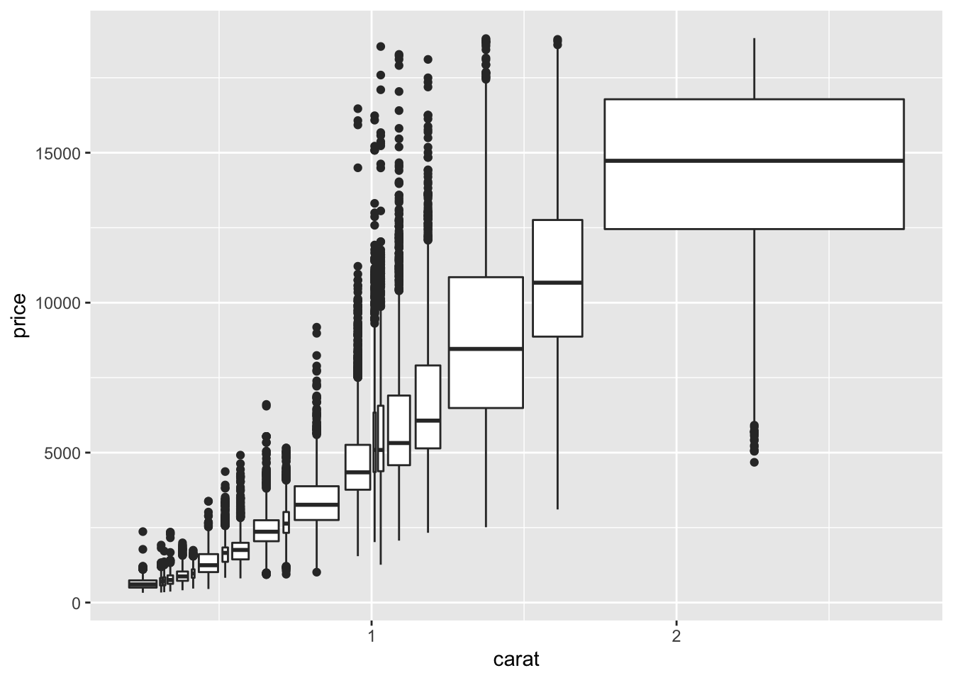
year <- function(x) as.POSIXlt(x)$year + 1900

head(economics)
## # A tibble: 6 x 6
## date pce pop psavert uempmed unemploy
## <date> <dbl> <dbl> <dbl> <dbl> <dbl>
## 1 1967-07-01 507. 198712 12.6 4.5 2944
## 2 1967-08-01 510. 198911 12.6 4.7 2945
## 3 1967-09-01 516. 199113 11.9 4.6 2958
## 4 1967-10-01 512. 199311 12.9 4.9 3143
## 5 1967-11-01 517. 199498 12.8 4.7 3066
## 6 1967-12-01 525. 199657 11.8 4.8 3018ggplot(economics, aes(unemploy / pop, uempmed)) +
geom_path(colour = "grey50") +
geom_point(aes(colour = year(date)))
year <- function(x) as.POSIXlt(x)$year + 1900
economics
## # A tibble: 574 x 6
## date pce pop psavert uempmed unemploy
## <date> <dbl> <dbl> <dbl> <dbl> <dbl>
## 1 1967-07-01 507. 198712 12.6 4.5 2944
## 2 1967-08-01 510. 198911 12.6 4.7 2945
## 3 1967-09-01 516. 199113 11.9 4.6 2958
## 4 1967-10-01 512. 199311 12.9 4.9 3143
## 5 1967-11-01 517. 199498 12.8 4.7 3066
## 6 1967-12-01 525. 199657 11.8 4.8 3018
## 7 1968-01-01 531. 199808 11.7 5.1 2878
## 8 1968-02-01 534. 199920 12.3 4.5 3001
## 9 1968-03-01 544. 200056 11.7 4.1 2877
## 10 1968-04-01 544 200208 12.3 4.6 2709
## # … with 564 more rowsggplot(economics, aes(unemploy / pop, uempmed)) +
geom_path(colour = "grey50") +
geom_point(aes(colour = year(date)))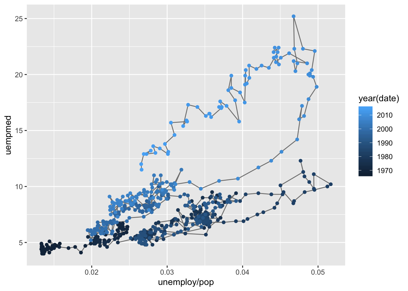
ggplot(economics, aes(date, unemploy, colour = pop)) +
  geom_line()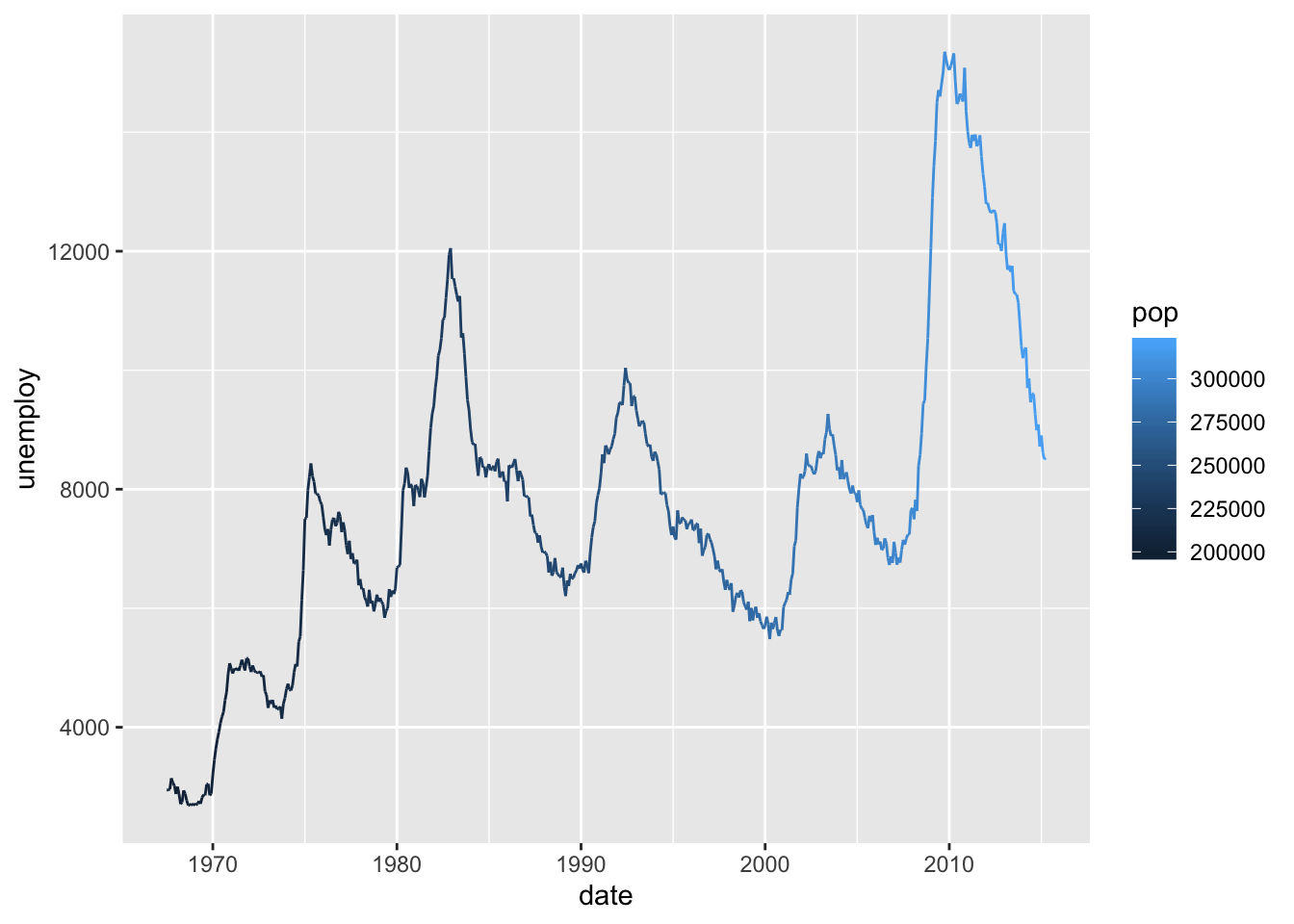
ggplot(economics_long, aes(date, value01, colour = variable)) +
  geom_line()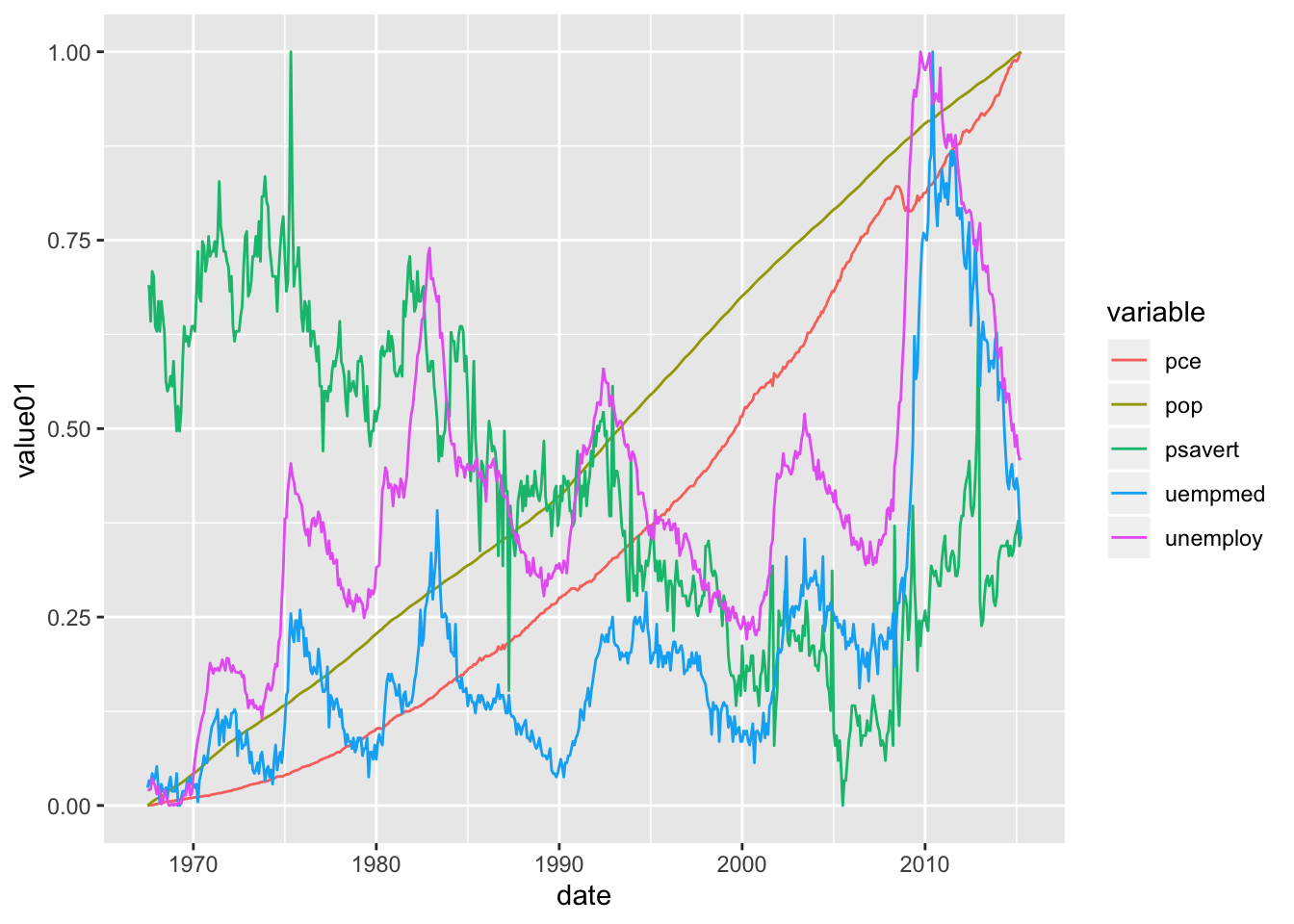
ggplot(economics) +
geom_rect(
aes(xmin = start, xmax = end, fill = party),
ymin = -Inf, ymax = Inf, alpha = 0.2,
data = presidential
) +
geom_vline(
aes(xintercept = as.numeric(start)),
data = presidential,
colour = "grey50", alpha = 0.5
) +
geom_text(
aes(x = start, y = 2500, label = name),
data = presidential,
size = 3, vjust = 0, hjust = 0, nudge_x = 50
) +
geom_line(aes(date, unemploy)) +
scale_fill_manual(values = c("orange", "green"))+ labs(fill = "Partido no Governo", title = "Desempregados", xlab="aaa") + ylab("Nº de desempregados") + xlab("Período")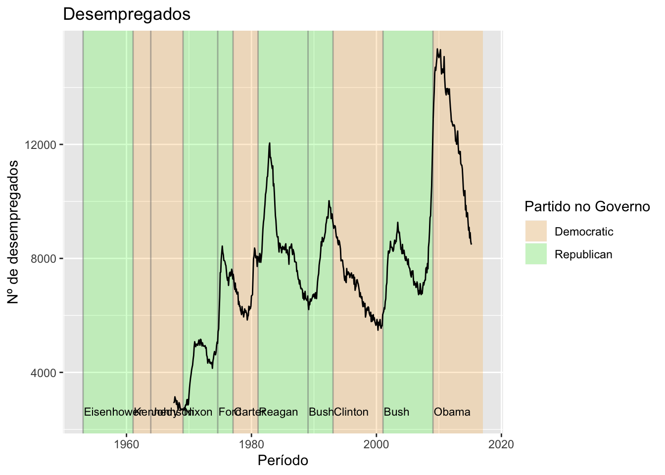
Viasuaizando distribuições
Distribuição populacional
ggplot(diamonds, aes(depth)) +
geom_density(na.rm = TRUE) +
xlim(58, 68) +
theme(legend.position = "none")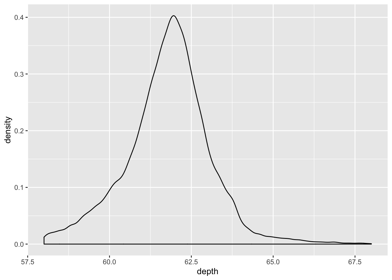
Gerando escalas
library(plotly)##
## Attaching package: 'plotly'## The following object is masked from 'package:ggplot2':
##
## last_plot## The following object is masked from 'package:stats':
##
## filter## The following object is masked from 'package:graphics':
##
## layoutset.seed(100)
d <- diamonds[sample(nrow(diamonds), 1000), ]
p <- plot_ly(d, x = ~carat, y = ~price, color = ~carat,
size = ~carat, text = ~paste("Clarity: ", clarity),
type = "scatter", mode = "markers")
p## Warning: `line.width` does not currently support multiple values.Distribuição por extratos
ggplot(diamonds, aes(depth, fill = cut, colour = cut)) +
geom_density(alpha = 0.2, na.rm = TRUE) +
xlim(58, 68) +
theme(legend.position = "none")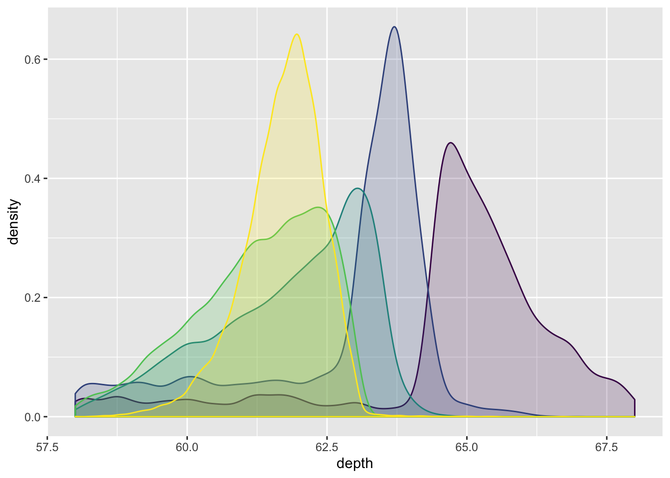
Utilizando linhas para dados enumeráveis
ggplot(mpg, aes(displ, hwy, colour = factor(cyl))) +
geom_line() +
theme(legend.position = "none")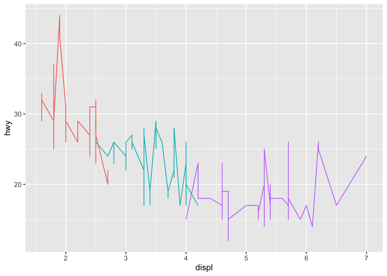
Melorando as linhas
ggplot(mpg, aes(displ, hwy, colour = factor(cyl))) +
geom_point() +
geom_smooth(method = "lm")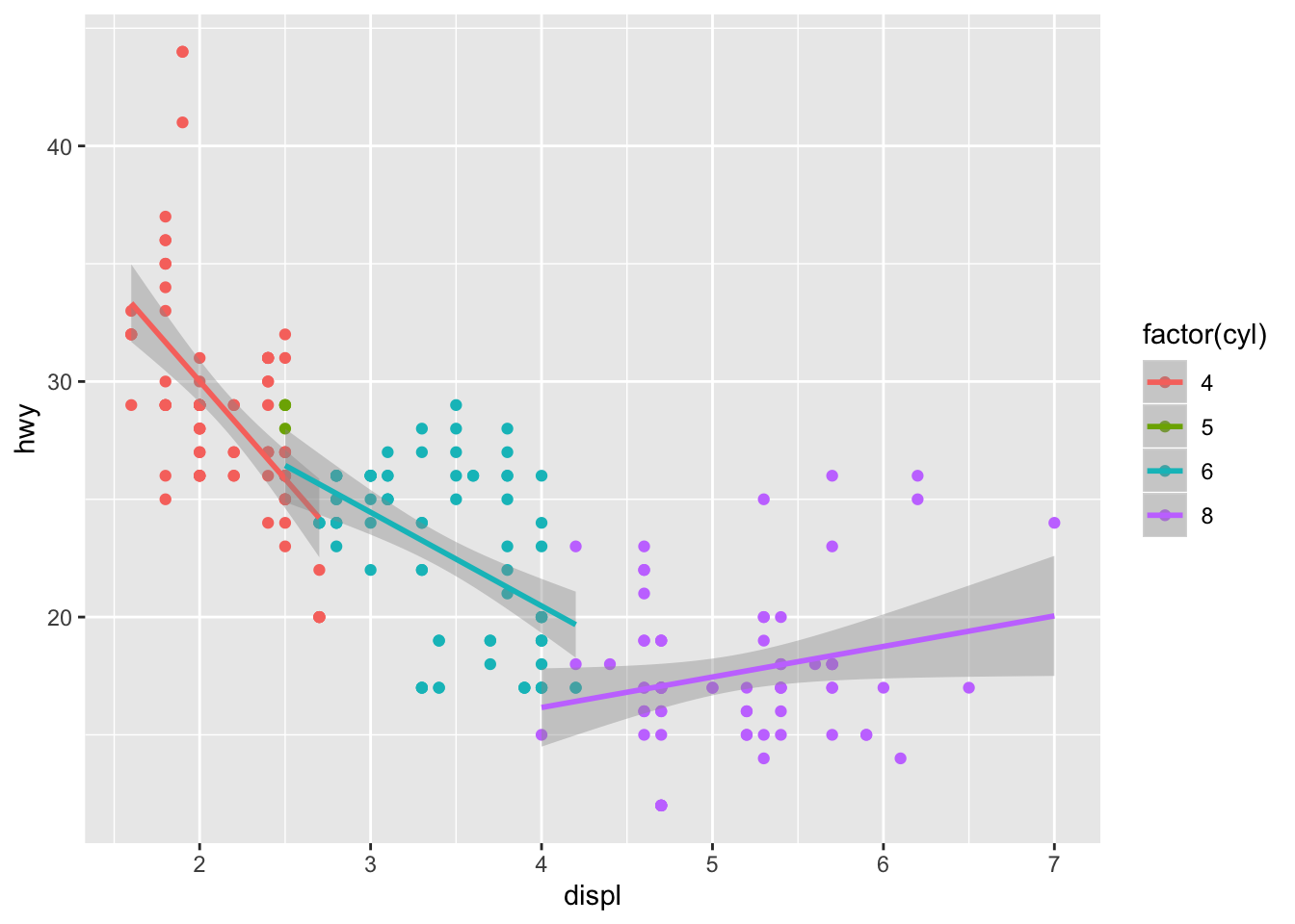
ggplot(mpg, aes(displ, hwy, colour = factor(cyl))) +
geom_point() +
geom_line() +
geom_smooth(method = "lm")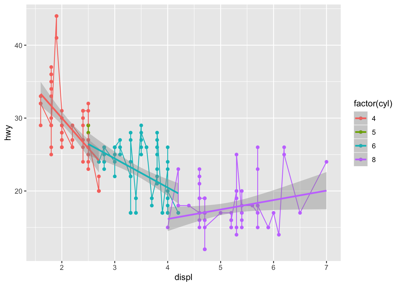
ggplot(mpg, aes(displ, hwy)) +
geom_point() +
geom_smooth() +
facet_wrap(~year)
## `geom_smooth()` using method = 'loess' and formula 'y ~ x'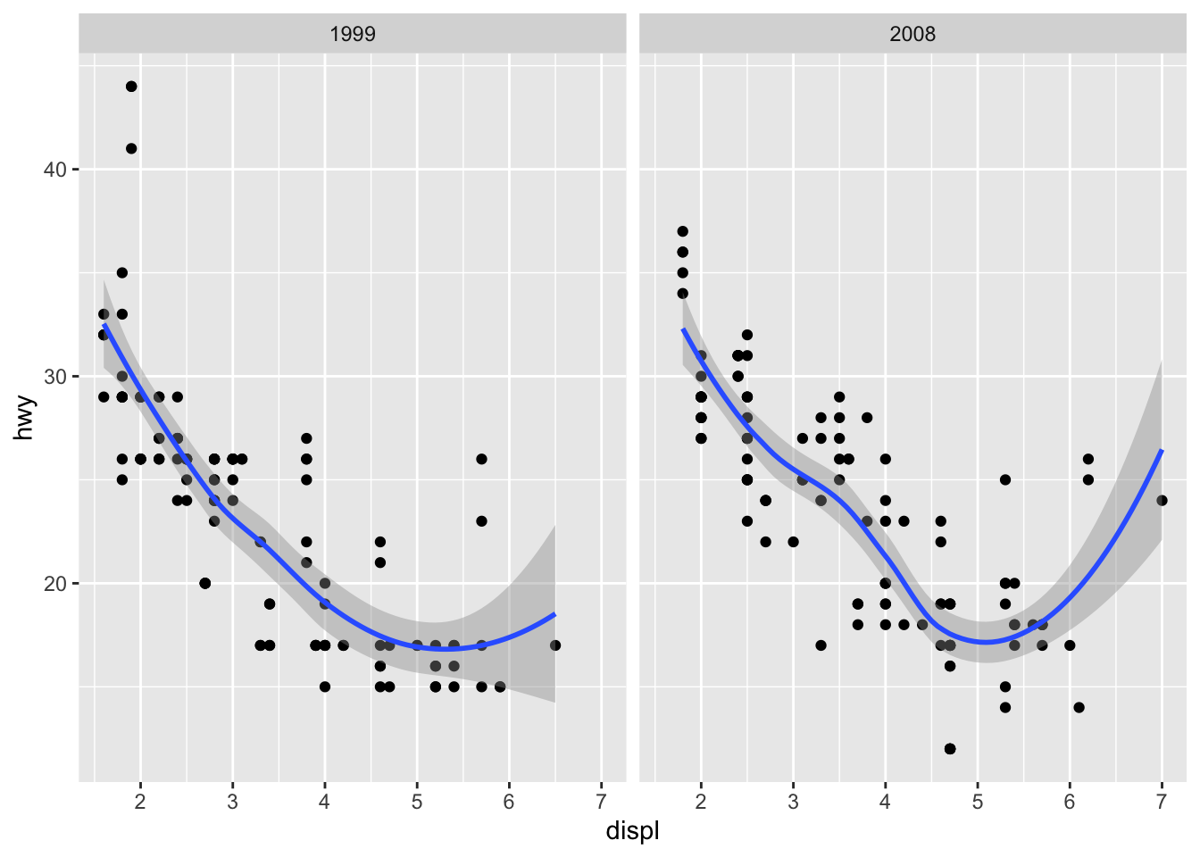
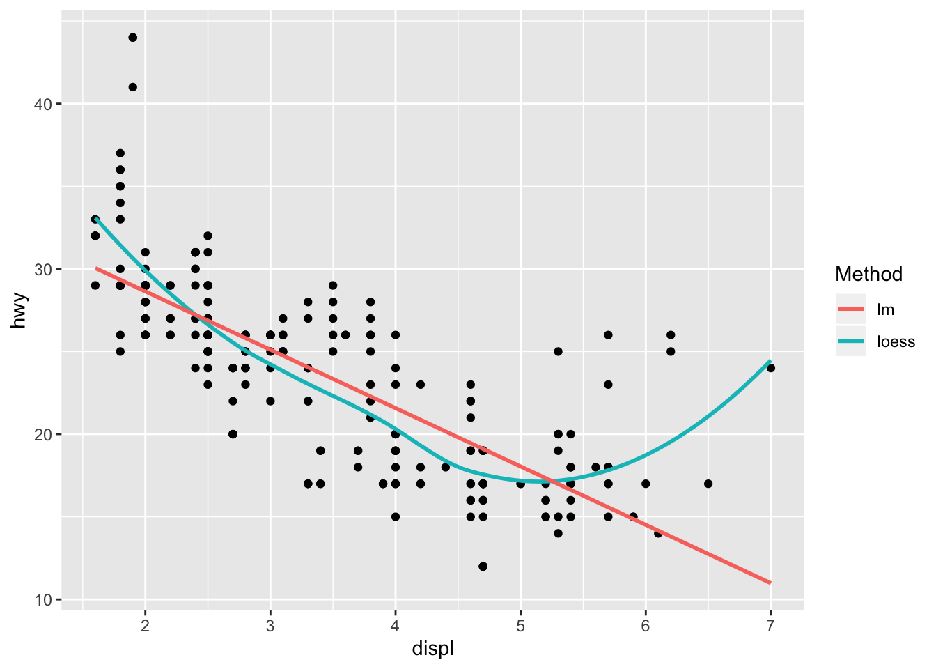
Regressão Local (loess)
ggplot(mpg, aes(displ, hwy)) +
geom_point() +
geom_smooth(aes(colour = "loess"), method = "loess", se = FALSE) +
geom_smooth(aes(colour = "lm"), method = "lm", se = FALSE) +
labs(colour = "Method")